You must log in or # to comment.
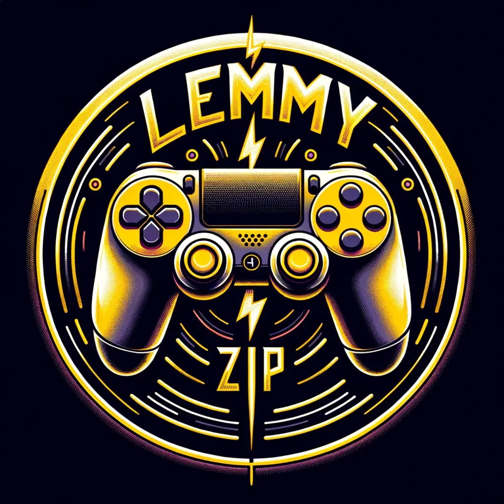
Where do all the logos of this style come from? They all look so same-y and bland. I’ve seen octopi, sharks, lions, eagles, bears, etc. all in this generic youtube gamer font, with bottom-of-the-barrel ‘mascot’ designs. Anyone else tired of this?


