A circle is a familiar shape reminiscent of a face and can be given mouth like animations, it provides a center for your eyes to focus where there would otherwise be a person.
Because face it, if they used anything remotely resembling a human the uncanny valley would deter most from using it.
Can’t argue with that, Clippy compares like shaggy versus piccolo.
But i didn’t mean it as if its mega intentional, its straightforward to come up with and just checks all the boxes for a an easy on the eyes simple interface, all it really has to do is indicate maybe 3 things. “receiving input” “generating output” and “system offline/malfunction” in a way that’s clearly visible and conventional for people to understand.
People with low vison and other disabilities are likely to be early adopters of mainstream ai even if not intentional its is important that this technology is as straightforward to use with as little interaction or senses required.

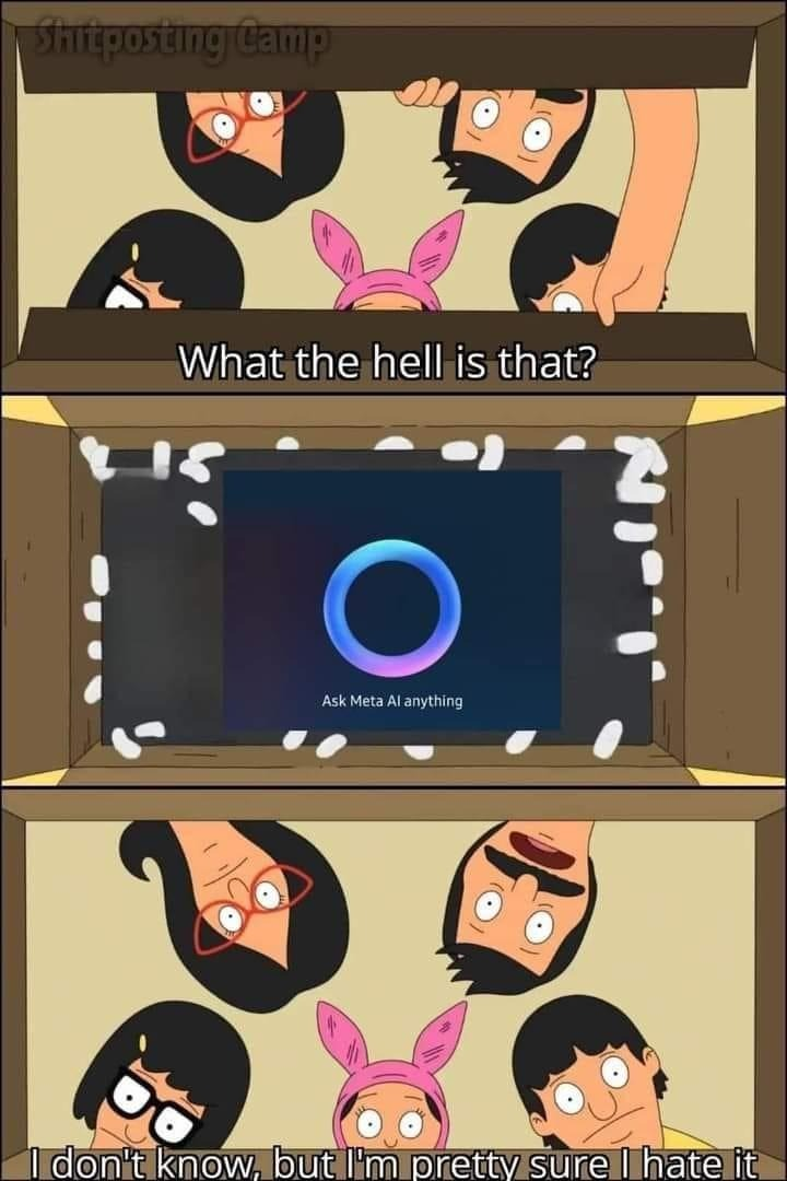
I would’ve thought the AI could have come up with a better logo than a blue circle
The brief was obviously “HAL 9000, but make it seem less threatening".
Honestly it does make sense.
A circle is a familiar shape reminiscent of a face and can be given mouth like animations, it provides a center for your eyes to focus where there would otherwise be a person.
Because face it, if they used anything remotely resembling a human the uncanny valley would deter most from using it.
So lemme get this straight: It has to look like a face, but can’t look like a face, so circle.
Nah, I don’t buy it.
If they can’t make an AI that appears more trustworthy, I’d rather argue with the Microsoft paperclip.
Can’t argue with that, Clippy compares like shaggy versus piccolo.
But i didn’t mean it as if its mega intentional, its straightforward to come up with and just checks all the boxes for a an easy on the eyes simple interface, all it really has to do is indicate maybe 3 things. “receiving input” “generating output” and “system offline/malfunction” in a way that’s clearly visible and conventional for people to understand.
People with low vison and other disabilities are likely to be early adopters of mainstream ai even if not intentional its is important that this technology is as straightforward to use with as little interaction or senses required.
A face suffocing? Or a smurf maybe…
Yeah Microsoft already did that years ago with cortana for some reason