The color palette is a reference to the method Piatnik (a card making company) was using to make Gypsy/Divination cards in the 1850s using screen printing. There were usually no more than 3 layers of color over which the black outline was finally printed ( + the color of the material of the paper). See example:
For the sake of creative liberties, you can see that while I did not resort to using just 3 colors, the divination content series does use same the color scheme.
To really make the palette reference visible, it would be a good idea to make a compilation post at some point. Maybe after 12 cards, if you decide to pull all of them together into a single image, or 13 as a reference to tarot. They’re quite good, and deserve to be beheld in their full glory.
It’s decent art with a significant number of confusing elements that I simply cannot parse, hence my saying so. Cogito hoc, ergo dico hoc. No offense meant.
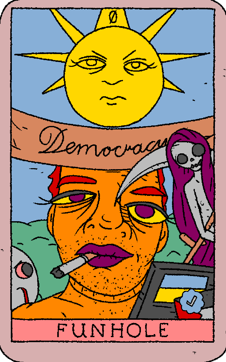
The color palette is a reference to the method Piatnik (a card making company) was using to make Gypsy/Divination cards in the 1850s using screen printing. There were usually no more than 3 layers of color over which the black outline was finally printed ( + the color of the material of the paper). See example:
For the sake of creative liberties, you can see that while I did not resort to using just 3 colors, the divination content series does use same the color scheme.
To really make the palette reference visible, it would be a good idea to make a compilation post at some point. Maybe after 12 cards, if you decide to pull all of them together into a single image, or 13 as a reference to tarot. They’re quite good, and deserve to be beheld in their full glory.
Careful what you wish for. Eyelashes may suggest an anti-transgender agenda.
To quote the man I do not know: “ars delenda est”.
It’s decent art with a significant number of confusing elements that I simply cannot parse, hence my saying so. Cogito hoc, ergo dico hoc. No offense meant.
If I see him, I’ll let him know.