
It’s important to remember that a lot of this data is biased. It doesn’t consider the subsistence farmers and people who obtain resources without the market. Nor does it take into account cost of living.
If you think about it, people who live “on less than a dollar per day” literally wouldn’t be able to live if they faced the same cost of living as people in western societies.
I’m not saying that these people are as rich as westerners (they aren’t), but the gap is exaggerated by the liberal worldview.
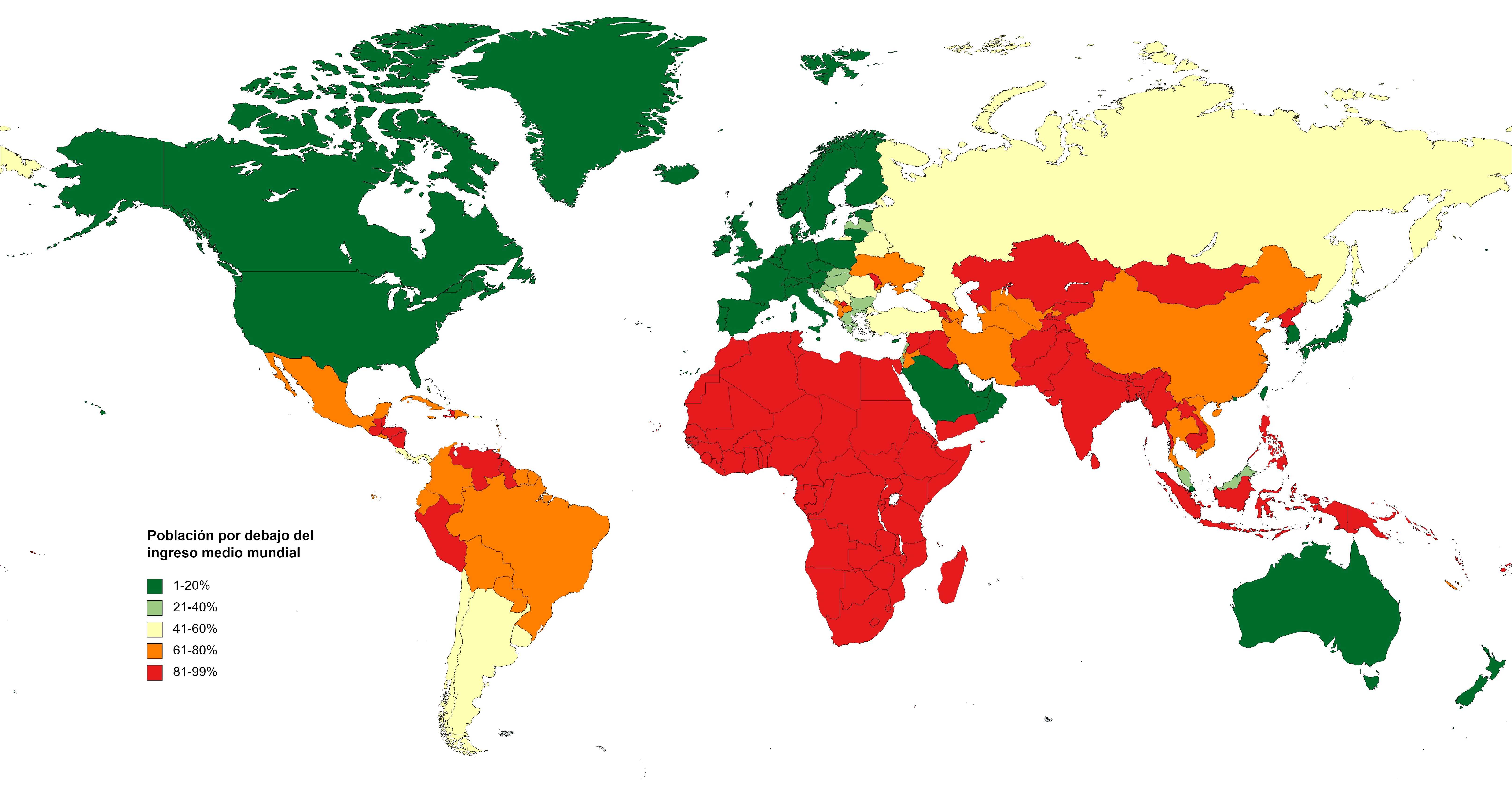
And in the other way, especially accounting for costs of living. Poland, Lithuania and Estonia in the same cathegory as Switzerland or Luxembourg is like the joke about man and dog having averagely three legs.
And in the other way, especially accounting for costs of living.
See my comment above.
Poland, Lithuania and Estonia in the same cathegory as Switzerland or Luxembourg is like the joke about man and dog having averagely three legs.
You are merely arguing against the presentation of the data on the map, not the methodology of the data or the conclusions made from the data.
PERCENTAGE OF THE NATIONAL POPULATION BELOW WORLD AVERAGE INCOME OR CONSUMPTION
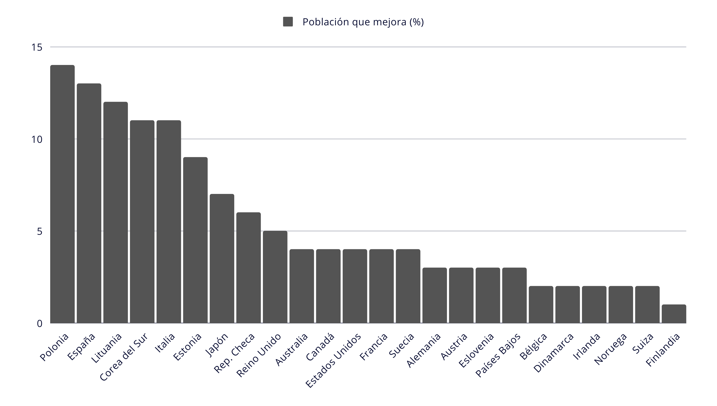
In this image found in the article I sourced the map from, it is made perfectly clear that Poland, with a population of 15% earning below the world average, is obviously vastly different than that of Switzerland of around 2%. In other words, proportionally, there are 7.5x more people in Poland that live with wages below the world average.
It is purely arbitrary that the author made the cutting off point for the legend 20%, when it could easily be in 10%, which would seperate Poland and Lithuania (but not Estonia) from Switzerland. The author could also have based it on quartile ranges (which would defeat the nature of this analysis).
You are merely arguing against the presentation of the data on the map, not the methodology of the data or the conclusions made from the data.
Yes, it lacks granularity. Also, statistics for wages in Poland are hugely falsified, as mentioned in my other post so you could probably add at least 5-10% to the above graph.
I didn’t expect Iraq, Algeria and Libya to be in the red. Most of the Arab World is poorer than I thought!
For Algeria everything is just cheaper in here and protectionism barely lets anything in, we get paid less but it barely matters

