

Credit: Mr. Lovenstein :: Over the Line | Tapas Comics
RSS Feed: https://tapas.io/rss/series/3346
Bonus panel (animated gif, wait for it)
My 5 and S look the same
My 5s are apparently unreadable for most people. Whenever someone asks me what that sign or letter is on anything I wrote I will say it’s a 5 without looking. They’ll say how I didn’t even look. But it’s always correct.
Your 5 is just a fucked up b, right?
No, it’s a 5. Idk why people don’t see it.
attach pic of your 5 and let lemmy judge
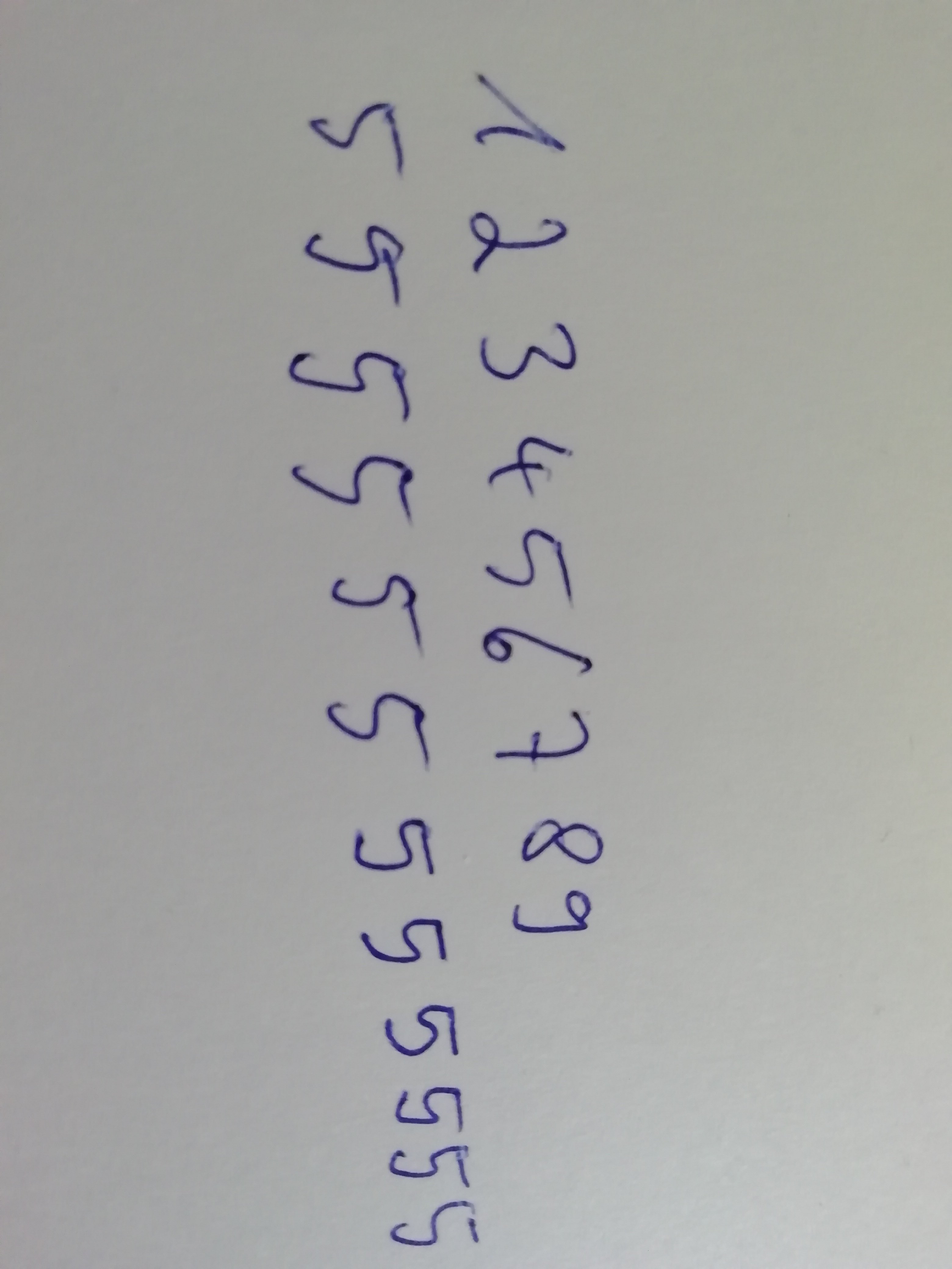
yeah kinda messy I rate 5/10
here’s my suggestion for making it less ambiguous
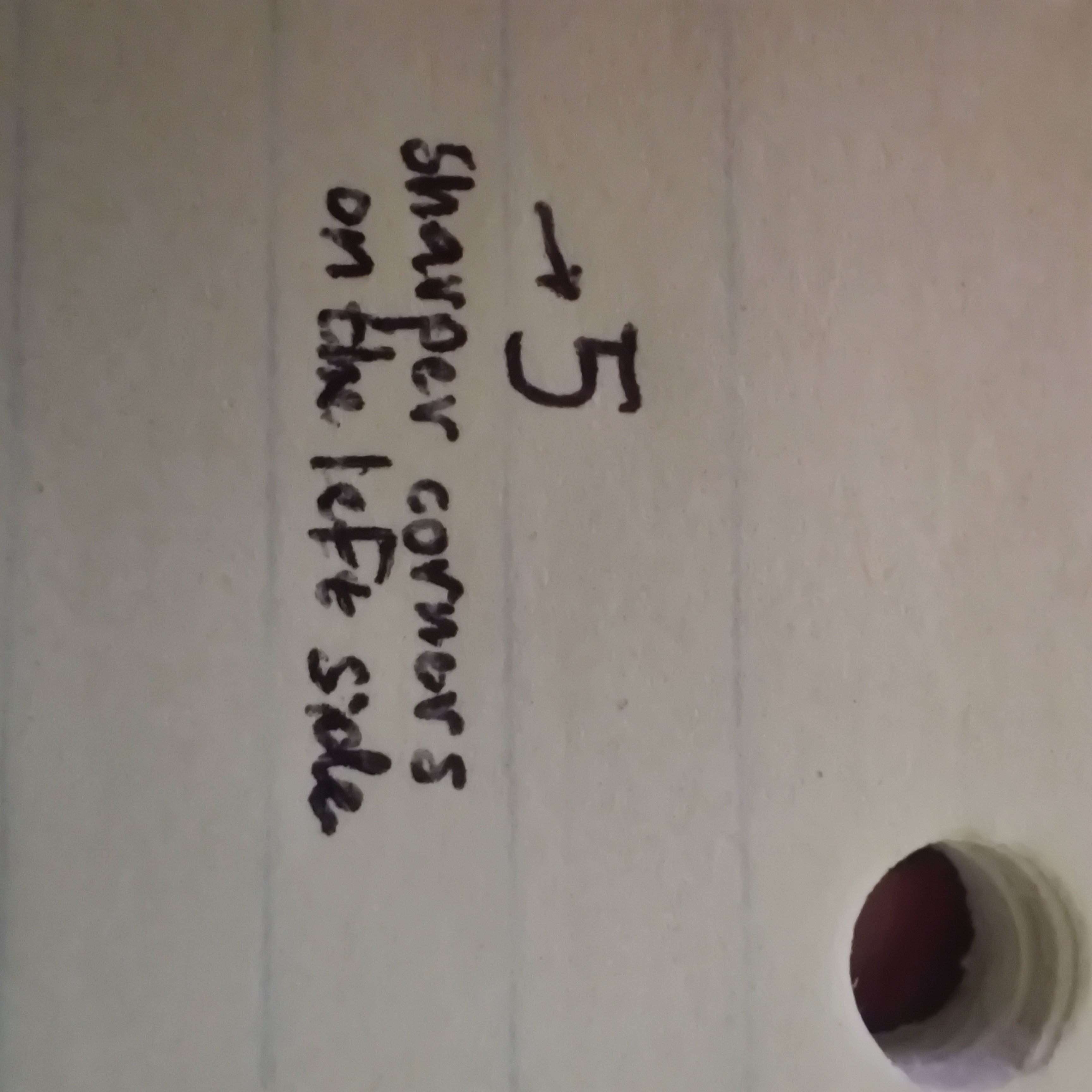
That’s still a 5 out of 10 though.
Good lord finally someone with legible writing
I think that’s perfectly readable. My 5 just looks like an upside down L.
I’d like to see too. My 5’s look like S’s so usually people can’t discern it when I write the number in writing.
Posted my fives as a reply to another comment if you want to check them out. Apparently they are 5 out of 10.
Yeah they’re a 5/10. They’re better than mine though, but I can somewhat see how someone may not know what your 5 is (emphasis on somewhat).
Same
5ame?
I draw the “top” of my 5’s with a separate line to help avoid this. Also I cross my 7’s and Z’s. If it’s just a jumble of alphanumeric characters, I’ll cross the 0’s and add the serif to 1’s.
Missed opportunity for “5ame”
Same, I can’t write a 5 in one smooth motion, when I try to it ends up looking like an S.
My 5 wears the top line like a floating hat. It’s frustrating even to myself
I went to Bangor, A55!
Just do the same to the other letters, so it looks like a stylistic choice.
Yeah, I just like to sketch every letter… it’s totally on purpose.
Ever since I was a kid, I’ve had trouble with 8s. To the point that the bottom part comes back together on the right side so it looks like a 9.
When I was little and learning how to write numbers, my grandma said my 8s looked. “sickly”.
Somethings never change.
Then I try to erase the whole word and rewrite it, but you can still see the D after I erase it so it looks even worse
i have a erasable pen (via friction thing)
Fun fact: these pens don’t actually erase, they just use heat to become invisible
Same diff
Cool info tho
Not same diff at all
The erasing can be reversed with cold
Don’t write secrets in erasable ink
Oh, I didn’t know it could be reversed. My bad.
It’s neat for writing fun secret messages. Just hold it above your stove or other heat source to easily erase the entire page, then have the recipient put it in the freezer a bit.
But yeah, don’t write anything too important.
They are so freaking good. I can’t just write the letters in the right orders for the life of me
That is my daily driver pen type too
The best is when you try to do that with one of the numbers on a check.
I just rip it up and start over. I figure it looks too suspicious.
The text line is the only one that matters.
Not when bank tellers are 18 year old kids
Who writes TODAY in All capitals on paper?
What happens more often is my sloppy 6 and 0 look too similar.
I’ve picked up a habit to (sometimes) write in all caps. On the flipside, I’ve picked up some strategies to differentiate letters and numbers from each other:
- 1 would have the top serif if it needs to be differentiated from lowercase
l. - 2 would start like a question mark, and then continuing on with a horizontal line, something like: ʔ︭
- 5 would be written in two separate strokes, the top one from left to right, and the second from top-left straight down, then a semi-circle going clockwise
- 6 would be written in one smooth stroke from top-right going counter-clockwise down, then up halfway, then intersecting itself at the bottom rather than bottom-left. (Kinda like φ)
- 7 would have the middle bar (differentiating it from a 1)
- 9 would have two strokes, first is a loop starting from top-right counter-clockwise almost meeting itself; second stroke goes from where the first one ends straight down-left-ish
- 0 would have a light stroke going from top-right to bottom-left
- D would be two strokes, kinda like this:
|> - I would have the top and bottom serifs
- J would have its top serif and its tail emphasized and angular, kinda like this: ˧˩̅ (I really hope the unicode characters show up properly)
- S would have its upper part smaller, and its lower part larger and more emphasized, so that it’d look more like a coiled snake.
- U would look like my lowercase u (with the right vertical downward stroke).
- V would be written in two strokes: top-left to bottom, and top-right to bottom.
- X is also written in two strokes: top-left to bottom-right, and top-right to bottom-left
- Z would optionally have the middle bar (
Ƶ), but it usually doesn’t need it to differentiate from2
I do the bars for 7, Z and the Ø for 0 when I’m worried about confusion. D I make sure the bar is straight or concave, in two strokes.
Also my 1s and lowercase Ls are both single stroke so to differentiate I make it look more like a mirrored J.
Just Đo it with the bar, yeah.
- 1 would have the top serif if it needs to be differentiated from lowercase
starting a to-do list i guess
Perhaps yeah.
For me it’s:
9 looks like 0
0 looks like 9
5 looks like S
6 looks like b
This extends to every day life… minor mishap? Nah fam… let’s introduce life ruining quest paths… what the F is wrong with me?
Me: “I’m lonely. I’ma find a gf or bf.”
One terrible marriage + divorce later
Me: “I’m lonely. But I’m too scared to find a gf or bf. What if it turns out like last time?”
You got this homie.
Wait till you are old (or rich, or qualified) enough for don’t give a fuck about weird looking letters.
I’m likely past the mid point of my life and still waiting for the day when I wake to find myself imbued with this sort of audacious level of confidence.
deleted by creator
Every damn time…
Every oamn time
Every olamn lime
Bust out the white paint and pour it all over the paper
The second one actually does read easier, and that’s because with characters it’s the thought that counts


