The title falsly implies that mercator is “incorrect”. Mercator is an angle preserving projection, meaning all angles are true to real life. The “equal earth” map is an area preserving projection, meaning it retains the true area of countries, but in return the angles are all wrong. This makes equal earth unsuitable for navigation for example.
It is also wrong to imply that this is some kind of new development. This was very much known all along, mercator simply became the default because world maps used to be primarily for navigation.
The title is incomplete, but then again the title is already pretty big without being “The UN has backed replacing the 500-year-old Mercator projection with maps that conform to the actual surface areas of the continents, including the Equal Earth cartographic projection, were appropriate”
We had some cartography classes in the university and since then I cant accept anything other than 3D globe or parts of it.
I don’t fly an airplane or sail a ship to need straight lines.
Yes, all of the 2D projections distort too much. When possible, half of the globe should be shown, from whichever angle is most relevant. Many people have no idea what a map centered on the North Pole looks like, and how close the countries in the northern hemisphere are to each other.
Traditional navigation is so cool, I had to learn the basics of it a few years ago as part of a course I was on. I suspect it’ll feel rather less ceremonial in the future if GPS jamming and spoofing continue to become more common.
Did you know intercontinental missiles navigate with the stars? :o
They navigate by the stars, and then briefly turn into one.
how is Canada smaller than the USA in this “equal earth” map when it’s supposed to display true areas? or is the pic in this post just shitty?
Canada (without the various arctic islands) is considerably smaller than the contiguous (sans Alaska and Hawaii) US.
Mercator projection is Canada’s pushup bra.
It’s bigger even if you include Alaska (and Hawaii, but you can ignore Hawaii because it’s small).
We’re repeatedly told in school and all throughout our media that Canada is the “second largest land mass in the world”. Is that not true?
Canada is the second largest country in the world by area.
Yes it is, but you have to include all of those islands, in particular Baffin island. If you just look at the contiguous land masses, the US is bigger, which is why it looks bigger on this projection. If you dragged all those islands together into Canada, then Canada would look slightly bigger, because it is slightly bigger.
Because Canada is ~10% smaller than the US.
And that, folks, is why map projections matter, and this update is loooooong overdue.
Canada is slightly larger than the US in total area. The US is a tiny bit larger when you just count land-area.
Well yes, Canada is larger if you count the ocean as part of Canada lmao
It’s not the ocean that’s being counted. It’s the Artic Islands.
Canada total area: 9,984,670 km^2
USA total area: 9,866,624 km^2
Have a look a the respective 2nd digits of those numbers and consider that 9 is indeed bigger than 8.
Source: Wikipedia.
Total land area: 9,093,507
You are counting ocean as part of Canada, a thing not represented on maps.
Imagine being this condescending and wrong.
No oceans were counted. But the total area does includes lakes and rivers.
And I already said earlier that the US slightly larger when you just look at land area. It’s no where near 10% though.
Imagine being this condescending and wrong
You’re the one doing it
Smaller in area?
According to wikipedia, these are the total areas of both countries:
USA: 9,833,520 km2 Canada: 9,984,670 km2
I am certain I am just misunderstanding the system behind this new projection but reading it is supposed to display accurate area, it seems Canada should show up bigger.
You have to look at the land area.
And lakes and rivers those count too
They’re about the same size. In this image, Canada’s northern islands are all spread out to show them inside their Mercator projections. You have to mentally add them to the large mass.
They look about the same size to me and they should be about the same size. So that checks out.
This post is a perfect example of why we need the new map, lol
Every few years this comes up again, and every time some nonsense about colonialism or whatever is brought up.
There is no “true” size or “true” shape on a 2D projection of Earth’s very 3D surface. We used the one projection for so long because of how coastal shapes don’t get bent way out of proportion, but like with any projection, messes with the other aspects.
Rather than making spicy click bait titles every so often about the “true” projection of the Earth, how about we teach kids at school what it takes to project something 3D on a 2D surface?
And just use a fucking globe!
As a neurodivergent map person, I’m over-aware of the difficulties of map projection. And I agree that simply calling this new projection ‘accurate’ is misleading
But at the same time, the use of the Mercator as the standard default map in situations that have nothing to do with ocean navigation for literally hundreds of years is absolutely a reflection of the relative power of the Global North, and can’t be dismissed as ‘nonsense about colonialism’
so coming from you pleasr tell us what would be the best way to project an as accurate as possible world map? I mena both in 3D version and as a 2D version
Pick one that suits your application.
If you’re not using it to engage in navigation, Equal Earth is a sensible default.
Tools like Google maps are a bit thornier. They’re used for navigation, but generally not in a way where angles matter. I could see someone getting themselves into trouble because the angles are screwy. But then again if Google cared about that sort of case, we wouldn’t have the recent story of the Gemini hikers.
That is not really an answer.
What is the best general world map to teach kids about the world, that we can put in a book or as a poster on the wall, without having to switch to different maps for each lessen, confusing everyone?
If it is not Mercator, then which one is?
For teaching kids Equal Earth is a reasonable choice. Scale and relative global position are conveyed better.
A side effect of Mercator massively distorting size near the poles, neither Europe nor Canada don’t feel as North as they actually are.
Kids don’t have much of a reason to care about specific angles.
I’d missed that story.
https://www.androidauthority.com/google-gemini-mountain-trip-hikers-rescue-3708165/
yeah, i tried to figure out the angle between two points off google maps the other day. it fucking sucked. i ended up using another website that was basically a frontend for doing it.
i’m still not sure if it was right. if i go orienteering again, i’m bringing paper maps. precharted routes and angles drawn in so i don’t have to look anything up out in the field. orienteering off your phone is stupid.
A 3D version would be a globe. A 2D version is inherently inaccurate because it’s 2D and the earth is not. You are free to pick your poison in the manner of your projection but you will always loose something.
So when it comes to picking a 2D poison which ome would be currently best? The new UN map ? or …
Or would a better solution for 2D be a ‘collection’ of pictures of the Earth from numerous different angles? And we just look at each of the angles seperately as their own seperate 2D picture of different parts of the Earth? So Im talking we supposedly take 14 or 20 or more different pictures of the Earth from 14 or 20 or more different angles of the Earth then we just lay out each of those pictures and it is up to the viewer to look at each picture of each angles of the Earth and to do what they can in their head with those pictures. Bad idea, good idea?
The Mercator projection really seems to be Africa-centric if anything
In what way? It inflates the size of areas as they get further away from the equator, resulting in Africa being portrayed as relatively much smaller than it is compared to Europe and North America
Africa is by far the most accurately portrayed part of the map, and it’s right in the center.
Now I’m imagining a dick measuring contest where the men care more about whose is measured most accurately for some reason, rather than showing off how long their dick is
The center - east to west - is 0 degrees longitude, defined as the Royal Observatory in Greenwich, England. This does also go through West Africa
The center - north to south - is 0 degrees latitude, defined as the equator.
Because of this, Africa is central on the vast majority of world map projections including the Mercator and the Equal Earth.
Accuracy is relative. The Mercator distorts areas bigger the further away they are from the equator. This exaggerates the size of the USA, Europe etc compared to Africa.
The big advantage is that the 180th meridian ends up in a very unpopulated part of the world. It is Chukotka Oblast and more importantly Fiji. For the current 0meridian style maps, that is two edges being without much population and not cutting too many continents.
it’s in the center?
Exactly. It’s easy to brush off the idea of soft power but it has real consequences.
It is complete nonsense. Use makes something standard, and maps have most been used in navigation. So it naturally becomes the default.
This is how ALL defaults become defaults, even when they’re wrong.
What better alternative projection they could use at the time for navigation?
You might note that the present is, in fact, not 500 years ago.
Is that the answer to my question?
If you’re asking me to tell you the best way to navigate 500 years ago, I can’t help you because I’m not a historian. The point is that really has absolutely no bearing on how we should use maps today in the present.
And the present doesn’t affect the past.
from the perspective of an art conservationist i’m not entirely sure i agree.
I don’t know? That’s not what we’re talking about. We’re talking about the UN using it not for navigation in 2026
But at the same time, the use of the Mercator as the standard default map in situations that have nothing to do with ocean navigation for literally hundreds of years
My question continues that thread.
And my point (subtle it may be) is that when something is wildly useful, it sticks.
Despite not being universally good.And to change from it you need more than just a slight advantage.
That’s why the UN didn’t think about changing map projection.
You know it’s the
ReverseTransverse Mercator right?It’s been the best way to transform a curved surface to a plane surface in a way that people understand.
It’s not the Reverse Mercator… I’m not sure what that is
Do you mean Transverse Mercator? Although it’s not that either
Yeah I did, thank you
Edit: and yeah we definitely use the transverse
(Well, we do sometimes but it’s not the map in question)
The link you provide says we use the Transverse Mercator projection
I screwed up with ‘reverse’ but it was transverse I meant and it’s what’s popularly used.
It says it is used. But it’s not the map this thread is talking about. It’s not the map the UN is replacing. It’s not the map in the thumbnail. It’s not the original Mercator map. Its not the most widely used map projection.
It’s used in specific situations yes

I mean, before the advent of GPS, ships at sea got a “fix” of their position by taking two measurements: north/south latitude (via a sextant when the sun was visible) and east/west longitude (via a set of very accurate clocks that showed the time in Greenwich England, which could be easily compared to the time aboard ship). Mercator maps are just a grid showing where all the land is as a function of these two measurements on the X and Y axes. Any other projection would have just meant a lot more work figuring out where shit was, which is why Mercator became “the” map. It had absolutely nothing to do with any attempt to make Europe appear dominant – Europe’s dominance when these maps came into existence was too obvious and unquestioned to need any parlor tricks.
For political uses new projection is better. UN body are not going to use that to navigate.
The only reason to have a default map is political.
People actually using maps and GIS pick whatever projection suits their needs - which is not Mercantor most of the time to begin with. I work with GIS a lot and never use it, unless forced by some API. But even then, reprojecting is trivial.
How do you use a globe on paper tho?
Clearly we need to invent globe shaped books.
Can’t use a globe, the Earth is flat! I did my research
I’m so sick of this shit. You want an accurate map? Buy a globe. There is no accurate flat map projections. All are wrong. Different projections have different flaws and serve different purposes.
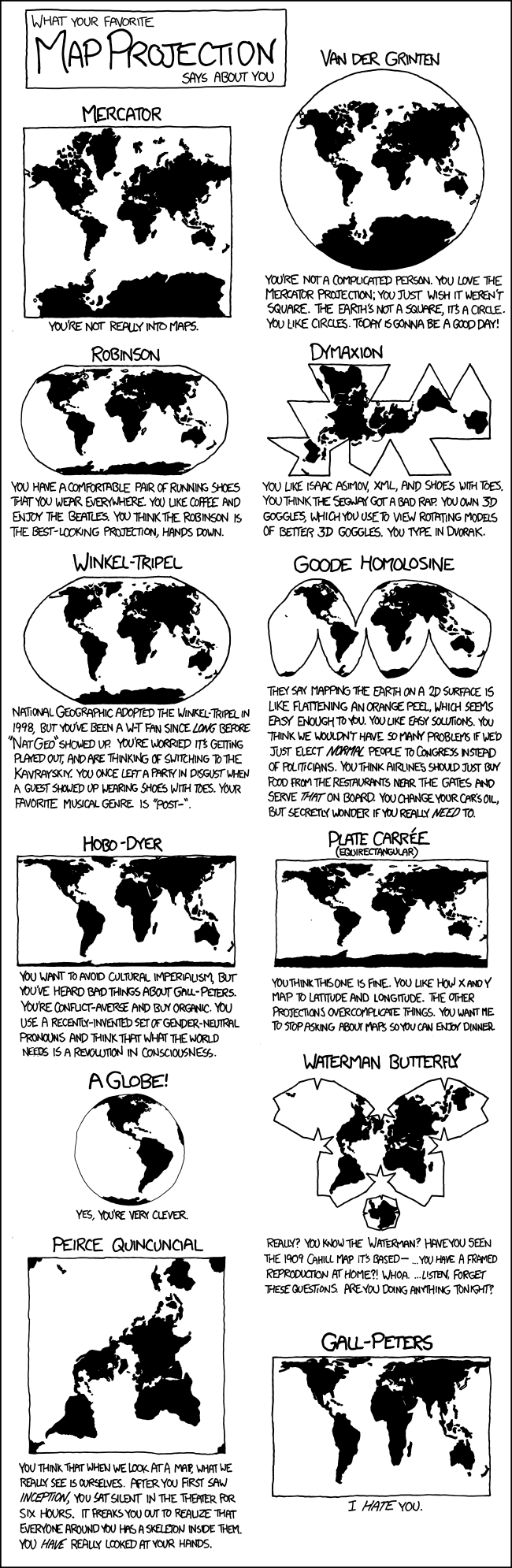
Yes, you’re very clever.
I think the world needs a revolution in consciousness.
I like Isaac Asimov, have owned shoes with toes, and mostly use my VR headset for 3d modelling. I tried Dvorak, but gave up when I realized it would be exhausting to use any other keyboard everywhere else.
Maps are especially used in education, i see it very hard to include a globe with every book and set up a big ass globe in every classroom but whatever
i remember during the breakup of yugoslavia our history teachers, who thought it important that we not only were familiar with but had memorized the capitals, names and locations of all the countries in the world and states in the us (literally that’s all we did one year for history. memorize locations and names and blah blah. that damn animaniacs song was a godsend to anyone who had a vcr). so they were bitching and moaning that they were having to buy new map rolls what seemed like every year because another country was declaring independence.
i was too young to tell whether he was being sardonic, like “they had to fight for independence and all i gotta do is get a new map pack woe is me” or if he was really complaining. but they have the good projectors now. should be a lot easier.
The problem with projectors is that then kids can’t see the globe at home, unless you ask them to see it online but a 8 years old kid hardly will be able do it (and i assure you, depending on parents being able to do it is a BAD idea, there is lots of parents who can’t or that will simply show the wrong thing) and it also means that you have to depend on internet access, what if internet access is down or electricity got fucked? (those projectors or smart whiteboards are so shitty that they would not be able to have an offline version)
Waterman butterfly looks very striking though, woulf make an awesome background on a UN logo
Really? You know the Waterman? Have you seen the 1909 Cahill map it’s based…
Also, unless you’re using a paper map, you should never have to see a flat map projection.
We all carry around supercomputers in our pockets that can easily do the math to render a globe. If we want to use a bigger screen, they have even more powerful processors.
Does anybody actually use paper maps at all anymore? I guess sometimes people mount them on the wall and point at them, but I mean using a map to calculate distance, find a path, etc.
What’s ridiculous is that even though computers should be rendering the world as a globe, some websites (even Google Maps) still sometimes use Mercator. It’s especially ridiculous when it’s something like a flight-tracking website where the flight is going in a straight line on the globe, but is rendered as a curved path on a stupid map projection.
I mean the good thing about a flat projection is that you can see everything at once. When you’re comparing data points of different countries it is nice to see them on a flat map. Neither the actual size nor the angles really matter in that case.
When you’re comparing data points of different countries
Why would you need a map for that? That seems like something where a table is more useful.
It’s more appealing visually and generally easier to navigate because you don’t need to search a country on the list, it’s easier to find it on a map

To be noted: usually those maps are paired with a table and aren’t made to give precise information
For most navigation people are going less than 50 miles projecting it onto a virtual globe would be pointless and not in any way shape or form beneficial.
So, you’re saying a more-or-less flat section of a globe should seem flat. Ok… and?
You said
“that even though computers should be rendering the world as a globe,”
They shouldn’t a projection is actually useful for most people in most instances. Your screen is flat and rendering a 3D image within it would actually mean you can use less of it and see less information in a more confusing view which would ultimately be weird and pointless to the people viewing mostly what is in fact stylized data like which roads cross.
Your screen is flat, and the surface of the planet is essentially flat. If a program starts with a mercator projection and zooms in on a particular area it’s always going to be a distorted view.
rendering a 3D image within it would actually mean you can use less of it and see less information in a more confusing view
Whaat? That’s nonsense.
Why do you think literally every mapping app on earth shows a projection onto the given x pixels by y pixels rather than a 3D rendering of a curved space again?
They don’t.
Does anybody actually use paper maps at all anymore
if i’m going hiking, yes. i don’t trust the phone to maintain a connection in the wild.
If you’re going hiking, I’m betting your map isn’t a world map, therefore the projection isn’t an issue.
Lol, good luck “accurately” mapping our irregular oblate spheroid on to a globe (i.e. a regular sphere). You’re correct that map projections inherently make concessions and introduce inaccuracies. But a globe would just require a different kind of projection in this context. And that projection hides more subtle inaccuracies. Globes are not an answer to the problem of map projection distortion.
You were so close. The countries in the UN judged that Equal Earth was better suited for the currently expressed needs than Mercator. Detailled purposes changed, prefered projection was changed accordingly.
164 to 1 countries have unanimously voted that the Equal Earth projection is better than the 500 year old colonial Mercator projection, chill. (1 dissenting vote was the USA)
In other news: Trump doesn’t want Greenland anymore…
Nah, he will just call the map “DEI”.
Actually, 164 to 1 countries voted in favour of the new projection, the one opposing vote was from the USA.
Trump property thought we really were making the world smaller.
Nah his admin is on about reviving the great western civilization of the 16th century, godless anti colonial uprising causing iits decline and “radical ideological projects” like that Mercator UN vote bahaha
Can’t get picky if you’re an orange.
This is true proportional/scaled size. I’m sure Russia is bigger than an inch wide as it’s displayed on my screen
I’m sure Russia is bigger than an inch wide
That’s just what the US Military Industrial Complex want you to believe!
pff. that’s tankie revisionist current eventstory
um, okay but this specific distortion is unhelpful to me. it just shows the extent of the distortion, not what the new map would be. the new map is the most pertinent piece of info.
This is a good and long coming change.
Reminder that the red depiction is also “wrong”, and not the equal area projection. The equal area projection map looks like this:
(Can’t upload pictures on blahaj piefed, HTTP 400 error)
In some senses, the red area is more wrong than the Mercator, since it is not a projection at all, but a false projection. The distances between the countries are misleading, especially when superimposed on the Mercator, which is also misleading in terms of sizes, but not shape.
All projections are compromises, but false projections are completely untethered from a mathematical relationship to the actual globe.
It is OK and not misleading if it were made clear that the red area is NOT a map, but a way of depicting the size only. Since it is shown in a geographic context with no disclaimer, i don’t think this is universally apparent.
Here is a link to a 3D globe: https://tembrica.com/en/earth-globe
Here is a good comparator of Mercator size vs equal size countries, not superimposed on a map. https://www.runcell.dev/tool/true-size-map/equal-earth-projection
Equal Earth
Areaprojection:
It’s great for countries in the middle, I.e Europe. Everyone else gets warped and slanted to the side.
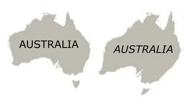
Gonna have to rename ourselves to Australia.
Huge boon to Queensland beachfront property developers though.
Don’t you mean: ɐılɐɹʇsn∀
There are many equal area world map projections, this one is called Equal Earth. It’s a very solid choice too. Although the very top and bottom of this map are still stretched when viewed on a Tissot indicatrix. Still way better than the shitty Mercator.
Why is the Mercator shitty? It has its purpose and it’s good in it.
It certainly has its purpose, and always will. People talk like it’s outdated from seafaring days, but not only is there still plenty of seafaring going on, the Mercator got a new lease on life in digital mapping applications.
I called it shitty just because I really like maps, and when it comes to world maps, I think it’s overused, and just plain ugly. I realize that is a completly subjective opinion.
Thanks for the correction! Fixed
@time2lose@lemmy.world update your post with the correct image.
Oh that’s clever, I was concerned about the longitude lines, but this is quite readable.
I just don’t like the one with missing slivers in the oceans.
Watch out, UN. My idiot president is gonna get mad.
To be fair, that’s his resting state.
All world maps are inaccurate except a globe. Equal Earth still shows distortions when you move closer to the poles. Instead of stretching along the latitude it now compresses along the longitude
How about Dymaxion

So where’s Antarctica on this map?
Penguins aren’t real, you fool!
Dymaxian is a pretty good one for showing sizes, useless for navigation though
Would be nice to see Antarctica
Pfft, you believe in Antarctica? Sure, a wHoLE ConTiNenT cOVeEreD in IcE.
Covered in ice for now.
Don’t worry. We’re well on schedule to fix that.
I was already aware how big Africa really is. I’m actually more surprised that Greenland is smaller.
I swear they did this so Trump doesn’t get grand ideas of expanding hugely.
Here’s to hoping it makes Canada less of a target as well.
I’m kinda surprised there weren’t tons of countries against this. For its faults in representing size the Mercator projection is great at representing direction (that’s what it was intended for after all). For Japan, New Zealand, and even Austrailia this places North at really awkward angles, making what are in reality straight lines appear curved. If anything, this is even more euro centric than the Mercator projection due to the amount of straight line distortion applied being longitude dependent, centered around Europe. I’d also expect Russia to be against it since it makes them look smaller, even if they don’t have the same distortion problem as countries directly opposite Western Europe.
The projection should have been changed, but it should be a a compromise projection like Robinson or Winkel Tripel that doesn’t perfectly preserve area, distance, shape, or direction, but also doesn’t horribly distort any of them.
making what are in reality straight lines appear curved.
Totally unheard of before.

Yes but with the Mercator projection the distortion is not dependent on longitude, only latitude. So for any given arc changing the longitude of both endpoints equally simply moves the arc without altering its shape. Adding distortion with longitude in addition to the already present distortion with latitude doesn’t exactly make the problem any better in my opinion, as the arc now depends on an extra variable. With modern tech it’s pretty surprising they don’t just use a globe in UIs everywhere, but equal earth although good for representing size is just bad for directions. The grids cities are built on usually orient North/South, but for cities on the edge these become diagonal lines in the equal earth projection. Basically equal earth requires a choice of either accepting that all grids will no longer be oriented toward North on maps or dynamically adjusting the top of the map’s viewport to point North.
I feel like showing true sizes is the only thing this does better. I wouldn’t want to study a world map where many countries are almost impossible to even see due to how small and skewed they are displayed as.
I think, you just have to buy a bigger map for that. With Mercator, it’s Africa’s countries that get squished down.
With Mercator, it’s Africa’s countries that get squished down.
But they remain perfectly visible due to how massive they’re to begin with. I don’t really see what the actual issue is.
So, what you’re saying is that you don’t care about the Gambia? 🥲
Part of me wanted to write something like Cambodia and see if you notice.
But more serious answer:
Personally, I fucking hate that I’ve been told incorrect information since young age. I wish every Mercator map had a warning like some countries have in their side mirrors.I also hate that it reinforces racist biases. But well, evidently you know the truth. And I do get being more interested in the countries in your region. Everyone is.
So, TL;DR: Fair enough. ¯\_(ツ)_/¯
No. Africa is nice and correct. It’s northern hemisphere that gets stretched out.
Well, alright, maybe “squished down” isn’t the right word. I meant that if you buy a map so small that you need countries to be stretched, so that you can read them, then the countries near the equator will be too small to read.