
This is the most complex one I’ve done so far, and I almost ran out of material (single straightened coathanger), so ~8 letters max. Coathanger is surprisingly difficult to bend into such intricate shapes. It took me around 2½ hours to do with two different types of pliers plus hand bending.
I literally freehanded this though, no predrawn pattern or anything, just following as close as I can to my own freehand cursive writing. I’m thinking about making a bit of a side job out of it, like $5 a letter…
What you folks think?
Edit: I made a point to weight balance it at the tip of the T for hanging on the wall or wherever.
Edit 2: Criticize me as necessary, my cursive is still slightly rusty…
Cowtney
Never learned cursive did ya?
Courtney
Your U and R blend together, does look like a W to a T.
Need more definition on the R.
Shit’s hard to bend at the scale to cram 8 letters in, but I hear ya. I do have smaller wire bending tools than what I used for this, but the toughness of the coathanger would probably break my smaller tools almost instantly… 🤷
Like I said, this indeed is a bit of a practice session, that’s the tightest I’ve been able to bend letters in a single coathanger. 6 letters or less is easier to define, but by 8 letters, I was more worried about running out of material, which I almost did…
Practice practice practice…
My mom wants one sometime soon too, but her name is only 6 letters…
I dunno, playing it by ear right now, but yeah I might need to look into other sorts of pliers or tools to better define the curvature of the R…
I could read it fine, it was obviously Courtney to me.
Thank you for that. Cursive writing is becoming a lost art, plus it’s difficult to bend by hand tools in metal.
I did my best, I’m practicing, and I’m open to constructive criticism…
I could clearly read the ‘r’. I don’t think your cursive needs much improvement :)
That being said, I think your earlier comment was downvoted for being a bit too aggressive. You get to choose which advice or criticism you take, but it’s graceful to keep it cool.
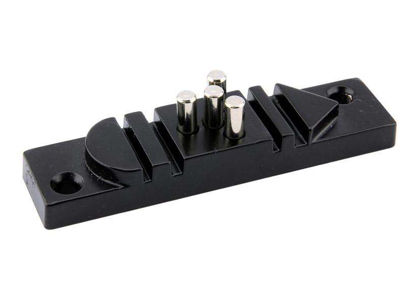
You might want to look up a “wire bending jig”. They’re not very expensive.
Some come with some predefined shapes, like a semicircle, triangle, and some grooves:
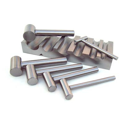
Others just have a bunch of holes and you can insert pegs and different size bobbins to make your own custom shapes:

You can also consider whether something like a wirebending mandrel would be useful to you:
Or even a swaging block:
Pliers are good, especially if you have a few different kinds (you can do a lot with just a pair of chain nose and a pair of round nose, but there are also fancier ones like wirewrapping pliers and “half round/concave pliers”). But for getting precise shapes, it’s nice to have a jig of some sort.
Oh, and if you don’t already use smooth-jaw pliers, I would definitely recommend switching to smooth-jawed.
Now that’s definitely a useful set of tools advice! 👍
Yeah, I do have some decent high school education in Metal Trades, but even with that said, we didn’t exactly have these sort of specialty tools to work with.
I am familiar with some of these tools though, but this is a nice menu of tools, some of which I haven’t seen before (but are fairly obvious how to use).
For right now, I’m somewhere between piddle practicing my skills with what I have, and seeing if anyone really wants to pay for my skills and time. If I start properly earning money from it, I’ll start upgrading my tools a bit…
I take it Kurtneigh is right out of reach.
If it was a w, it wouldn’t drop to the bottom and then go into the t. It would just directly go to the right and start the t. At least how most people write cursive.
Everyone that knows cursive writing knows it in their own way, but I get you that sometimes some people’s writing kinda ‘blurs’ together like that…
If I may ask, constructive criticism, could you show me examples of where I could try to improve?
Bending stiff metal like this isn’t exactly easy ya know…
I agree that it’s readable as Courtney. I don’t think this would necessarily be easy, but you could try pinching the left side of the R like this:

Now this is productive advice!
This isn’t a detail I was taught in cursive writing, but I’ll definitely keep that in mind for the next round… 👍
Do you have any particular advice links for any particular ‘standard’ on cursive writing?
I really am practicing here, I learned wire bending before I learned cursive, so any and all criticism and advice is welcome…
I learned well over 30 years ago, but after looking through a few sets this site matches the lettering I was taught.
Mind you, I don’t think many people will recognize that Q for what it is anymore, my name includes a capital Q and I always write it in block and start the cursive from the squiggle. (I was taught the Q as it is in that practice set though)
It was constructive, whether you liked it or not. A person conveyed that the word can be read differently. It is absolutely your choice to do or not to do anything about it, but you just got protective and started saying that the person who criticized you has to learn or show you something.
Nice work, but I kind of don’t like you already, so that affects how I see it.It’s been a long time since I’ve written cursive, so I asked constructive criticism, not for an asshole.
I learned cursive in second grade, like 8 years old, and it drifted from there into my own form of cursive writing. So sorry if I don’t remember every exact way to curve an R or a T.
You don’t have to be an asshole about it, I’d MUCH rather an A/B comparison, graphically, how I might have better drawn it…?
Bending metal by hand tools isn’t exactly easy, but if you got a better pattern to follow, then I’m all open eyes…
I ask graphical constructive criticism rather than asshole attitude, please.
Just trying to get back into art.
Have you thought about getting a 1/4 or 3/16 pipe bender? They’re like $20 on amazon. Still “hand” tools.
okay
I meant that I think how you did it is correct. If it was a ‘w’ it would be a direct line to the ‘t’. It wouldn’t go to the right, then have a 90 degree turn down. So I don’t think it makes much sense to read it as a ‘w’.
Cursive is never going to have letters quite as distinct as printed text simply based on all letters being connected. So people can always interpret it differently than intended, but I think what you wrote is legible and easy to read.
I hope this is constructive, it may also help to rotate/tilt the r ~10 degrees clockwise to give it a little extra space from the u, as well as make the shape more distinct.
Thank you, and yes this indeed is constructive advice 👍
I’m still warming back up and practicing a few names basically for free, for good friends only right now. My next freebie is gonna be for my mom, plus I probably ought to do my own name as well…
There is one other complication though, that I at least try to fit in. Weight balance for a single balanced point to pin/hang it level.
Not all names lend themselves to a good weight balance point, but Courtney happened to come really close with the T in the middle like that, but I never know exactly where the balance point might be until I’m done.
In Courtney’s name, I planned for the top of the T to be the hanging point, but once I was done bending/folding the name, the left side of the T was a bit heavy, so I fudged the kerning a bit, compressed the left side in some and stretched the right side out a bit, until it balanced out level. Hence the seemingly stretched out N, cuz it is, but it made it balance about the tip of the T…
Oh man, I hadn’t even considered the balance. That only adds to the impressiveness!
This how I would write “urt” in cursive.

Nope. It’s either boobs or a poorly formed W. UU. Boobies!
Boobies: 333
I learnt only cursive and it still looks like Cowtney to me.
People shouldn’t need to learn how to read cursive, only how to write it. You should aim for a font that is as easy to read as possible, that’s just standard advice for any form of writing.
Be less prescriptive in the right and wrong way to do cursive. For example, the join between the u and the r could use a distinctively different curve to the curve used in the u. Less symmetrical, probably a wider arc. That would reduce and resemblance to a w, which people are seeing due the level of symmetry. That probably conflicts with the arbitrary rules you’ve got in mind for how to do cursive writing, but it would make it easier to read and still be in keeping with the cursive style.
People shouldn’t need to learn how to read cursive
Uhh, citation needed? There’s tons of (beautiful) artistic cursive that’s probably completely illegible to people who only learned printing. And then to accuse OP of being prescriptive and in the same breath prescribing a completely arbitrary requirement that cursive mimic printed script.
No citation needed for my opinion.
There are good and bad cursive fonts. If you want to write in fonts that people need to learn how to read, go ahead. Just don’t get butt hurt when people read it as Cowteny.
I’ve offered some advice which OP is under no obligation to read or act upon. Reading the other comments here, they are showing frustration that people aren’t constructive enough so hopefully it is well received.
My advice to you, which you are also not obligated to act on, is to chill.
Yes, you have offered some useful advice 👍
The way I was taught cursive writing is basically this…
https://www.superteacherworksheets.com/cursive.html
So, my natural cursive writing leans towards that, but yeah I should at least attempt to better distinguish certain letters wherever I can.
Indeed, I might slightly try to tweak a couple/few letters to better distinguish them, but I’m also gonna stick close to my OG handwriting, unless presented with a specific style.
By the way, the tip of the T is weight balanced as a pinning/hanging point. That’s not easy yo…
Holy shit you got a harsh audience
It’s pretty
Thank you 👍
I actually appreciate the ‘harsh’ audience, for constructive criticism, and some comments here have given good useful advice where I should try to place my focus to make letters more easy to distinguish. But I don’t consider hardly any of the comments as particularly ‘harsh’, more like just trying to be constructive.
While I’m definitely gonna keep all the constructive advice I’ve been given in mind, I’m still gonna mostly stick close to the cursive writing I learned long ago, just maybe with a little better emphasis on certain letters wherever I can.
$16/hr for this project.
This fella crunching the hourly figure, and you’re right 👍
The one I posted was more of a practice piece to get back into the hang of it, this one for free, because she did us a good solid favor, plus I’m pretty sure she’ll at least try to share my work and try to get me some more business…
I think the point is that this is pretty cheap. Might want to go a bit higher.
Kinda, I’m really just pointing out numbers. OP has to decide what they want out of their hobby; Is it just for fun and recouping some cost makes it worthwhile (hobbies can be expensive) or is it to earn a profit?
I just like data.
Data? I used to pull 7 letter names out of paperclips like this (still can actually).
That was a hobby, coathanger is hands on practice for something bigger, which I’m already getting local requests for…
Git good 7 of 9.
back into the hang of it
heheheheheh
This is a weirdly specific coincidence because Courtney was the first name I ever bent a metal wire into. I love that name and I love how it looks in cursive.
Next you should do “minimum”
After that, you should do antidisestablishmentarianism.
That’s gonna take at least 4 coathangers homie, and I don’t have a welding machine…
Where’s the dedication to the art!?!
His name was Robert Paulson
There you, that’s the spirit! Entire sentences now!
aluminuminuminuminuminuminium
At minimum they should do minimum once
Criticize me as necessary, my cursive is still slightly rusty…
That’s why I use plastic hangers
Cool! You inspired me to try something like that. I’m gonna try a slanted cursive modelled from my own writing.
Thanks 👍
I haven’t done this all too many times in life, but I’ve been bending wire ever since I was 5 years old, but usually much thinner wire for electronics and such. I started occasionally bending names out of paperclips back when I was like 25 or so.
Paperclips are a lot easier, with the right tools at least, for obvious reasons. I only started with coathangers like 5 or 6 years ago during lockdown. It’s definitely a more rigid material, and thus far takes me a couple different types of pliers you’d usually find in a garage toolbox.
Currently I’m using a pair of hefty needle nose pliers plus parallel pliers similar to channel locks. If I do start getting some actual business out of the hobby, I’ll see what other useful tools I can find at Lowes.
I’ve asked folks in advance if they want to write out their own name so I can try to follow their pattern, but so far people I’ve done this for are happy enough with my own writing that they just give me their proper spelling and tell me to just do it my own way.
Good luck to you fellow artist, I’d love to see an example or two of whatever you come up with eventually…
Thank you and all the best to you.
cowitney is a baller name… (I kid, must have been murder to bend this up, have used same material for sculpture armatures and it’s cheap but strong)
and when they get older they can heat them up and use them to brand their mates and/or cattle.
Hmm, that’s pretty cool. I think you could drastically speed up the process by superheating the metal somehow (blowtorch or something?)
Interesting that you were able to balance it from the ‘t’ like that. Do you mind sharing how you did that?
I could see these also becoming popular for people to watch if you were interested in video production as well.
The balance was sort of a last minute idea, totally cold metal work.
Once I was basically done with the overall curve shape, I figured the tip of the T would be the best balance point, but the left side hang a little lower.
So, I ever so slightly compressed the left side and stretched the right side, until it balanced out. Just a little fudging on the kerning, until it balanced where I wanted…
It’s a very cool and unique idea. Don’t let haters get you down. But squeeze the vertical bar of the ‘t’ together above the crossbar, for God’s sake. I just can’t with young people these days, half-arsing their way through life, I dunno … !
😉
It’s very difficult to fully fold the lowercase T in like that, hell I want to as well…
I mean like it’s not impossible, but I also think to myself, like if you had to cross the T while you’re writing a word, rather than after you’re done as conventional, then how would your single solid stroke go?..
Thanks for criticizing my T’s actually, I was wondering when someone would…
Might need to reevaluate pricing. I certainly wouldn’t do that for $16 an hour.
If people won’t pay more, then it might not be feasible.
Oof, where I’m at, I already know that people aren’t inclined to pay more, at least not right now. I currently have a request for two names for my roommate’s sister-in-law for only $3 a letter, but with the understanding that the official price I’m gonna set is $5 a letter, while she shares my works on Facebook to try to get me some more business.
I don’t do Facebook, and ain’t about to start, but I could use the local friendly helpful publicity, plus a bit of practice to git gud…
My mom’s name is next on the practice name list, but of course hers is gonna be free too. Practice makes perfect, but yeah I should probably put a little more effort into defining the lowercase R, a bit easier said than done though…
It looks like a cursive r to me
this is dank thank you for sharing!
deleted by creator
Great idea. But i agree, the r is weird.
Hey, that’s the way I was taught, and the way I write my lowercase R is indeed how they teach (or at least used to teach) traditional basic English cursive. So, within the constraints and complications of bending and folding coathanger, that’s basically how my works come out.
I usually ask people before I bend their name if they want to provide me with an example of their own signature instead, but so far everyone tells me that either my cursive is better than theirs, or that they just don’t know cursive in the first place.
But hey, if someone did ask me to do their name, and provided me with their signature as a pattern, I’d definitely try my best to follow their pattern instead.
Cowrney
Joke all you want, you missed the T altogether, which is the balance point for pinning it up on the wall, or even just hanging it up from the ceiling, level…
I think you need to drop that second Loop coming after the U and either needs to be a straight line going up to the r or you need to come across from the top of the u


